Besign Walk Osaka: Order in Restraint, Warmth in Detail.
BESIGN WALK
2025 / 06 / 06

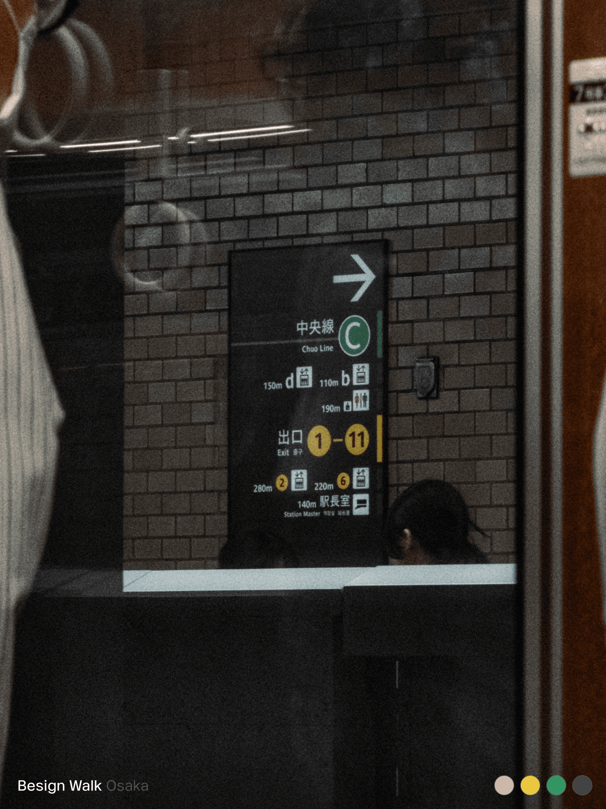
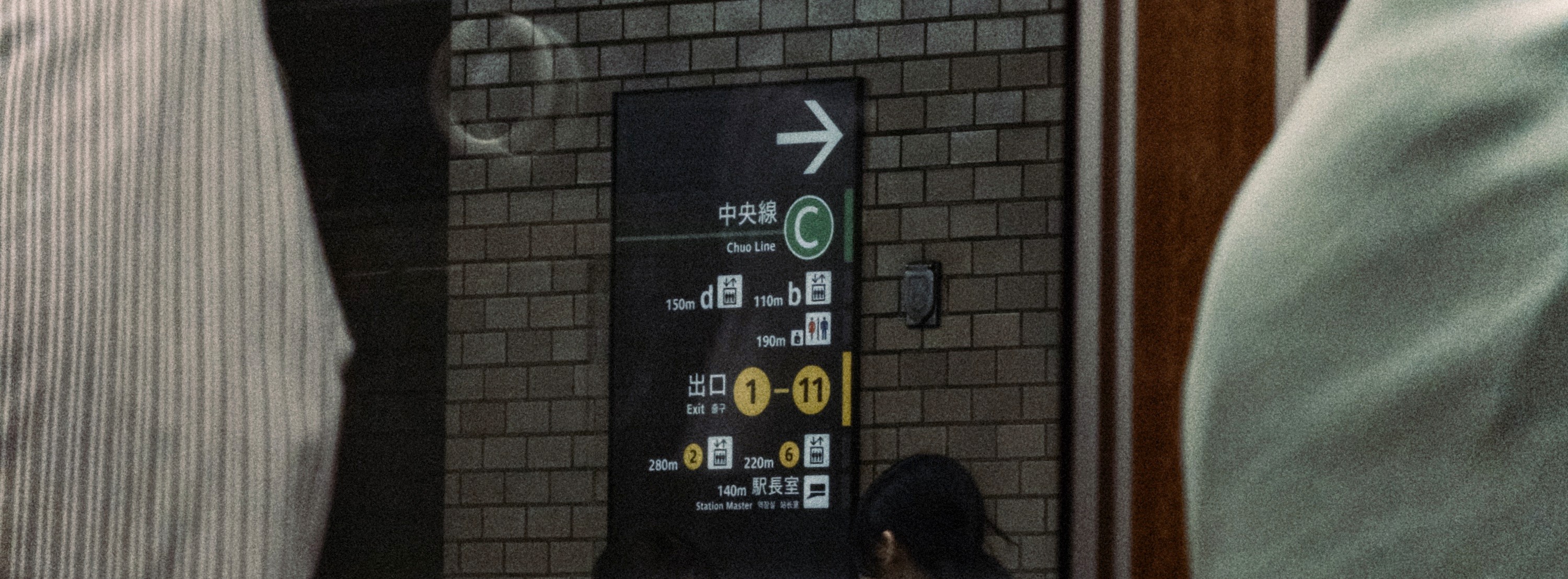
Wayfinding Design of Osaka's Public Transportation System: The use of high-contrast combinations with bright text on a dark background ensures that passengers can quickly obtain directional information even while moving swiftly.


Many small shop signs on the streets of Osaka use stylized fonts against solid color backgrounds, without unnecessary embellishments, conveying personality precisely.
In early June, the Besign team traveled to Osaka, Japan, and embarked on an urban design exploration walk. From the signage systems in subway stations to the signs of small street shops, and from the stickers on public facilities to the packaging design of convenience stores, we attempted to capture the design philosophy that emerges from the everyday life of this city.
Osaka's public transportation wayfinding design: By using a high-contrast combination of dark backgrounds with bright text, it ensures that passengers can quickly grasp directional information even while moving swiftly. Universal graphic symbols and numbers (like '100m') replace multilingual text descriptions, reducing the understanding threshold for foreign visitors and avoiding information overload. The colored bands and directional hints on handrails are intricately integrated into the flow of movement. This precise balance of efficiency and universality is not just aesthetically pleasing but also considerate of everyone.
Many small shop signs on the streets of Osaka use stylized fonts with solid color backgrounds, free of unnecessary decorations, conveying brand personality and functional positioning accurately. City infrastructure like signal control boxes are also given attention, with stickers using monospaced fonts to mark numbers, making maintenance easy while maintaining cleanliness and consistency, reflecting the 'visible efficiency' and 'invisible thoroughness' in Japanese design.
In convenience stores, food packaging presents an almost engineered aesthetic of information density. The use of vivid color distinctions, clear hierarchy of primary and secondary text, and unified layout logic allows consumers to make decisions and choices within seconds. This combination of 'high information + high order' is the most effective means of communication in high-frequency consumption environments.
In Osaka, design exists not only for its 'beauty' but also to be better understood and more naturally utilized. It lacks excessive decoration, yet in every thoughtfully placed detail, it expresses a respect for publicness and a meticulous care for people.
Besign will conduct more design walks in different cities to explore diverse regional design cultural styles.